
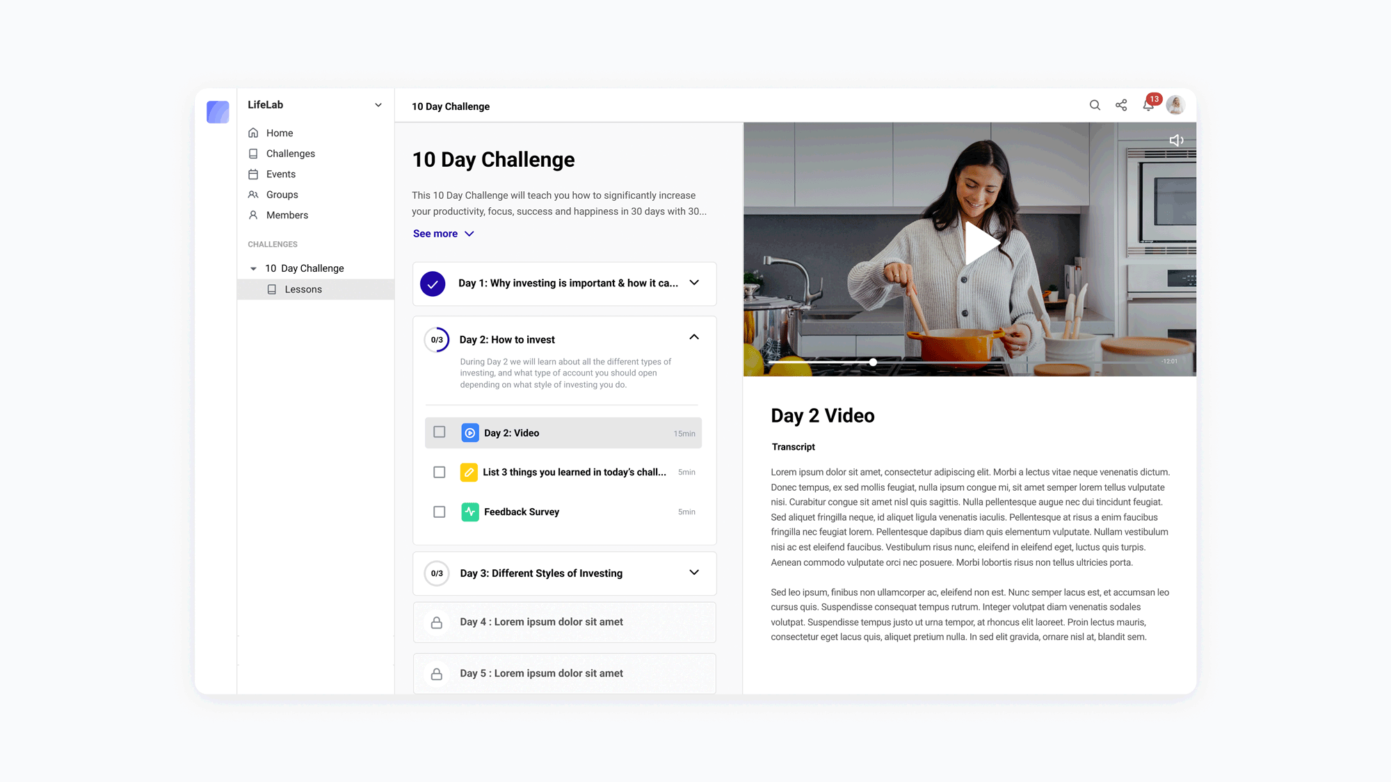
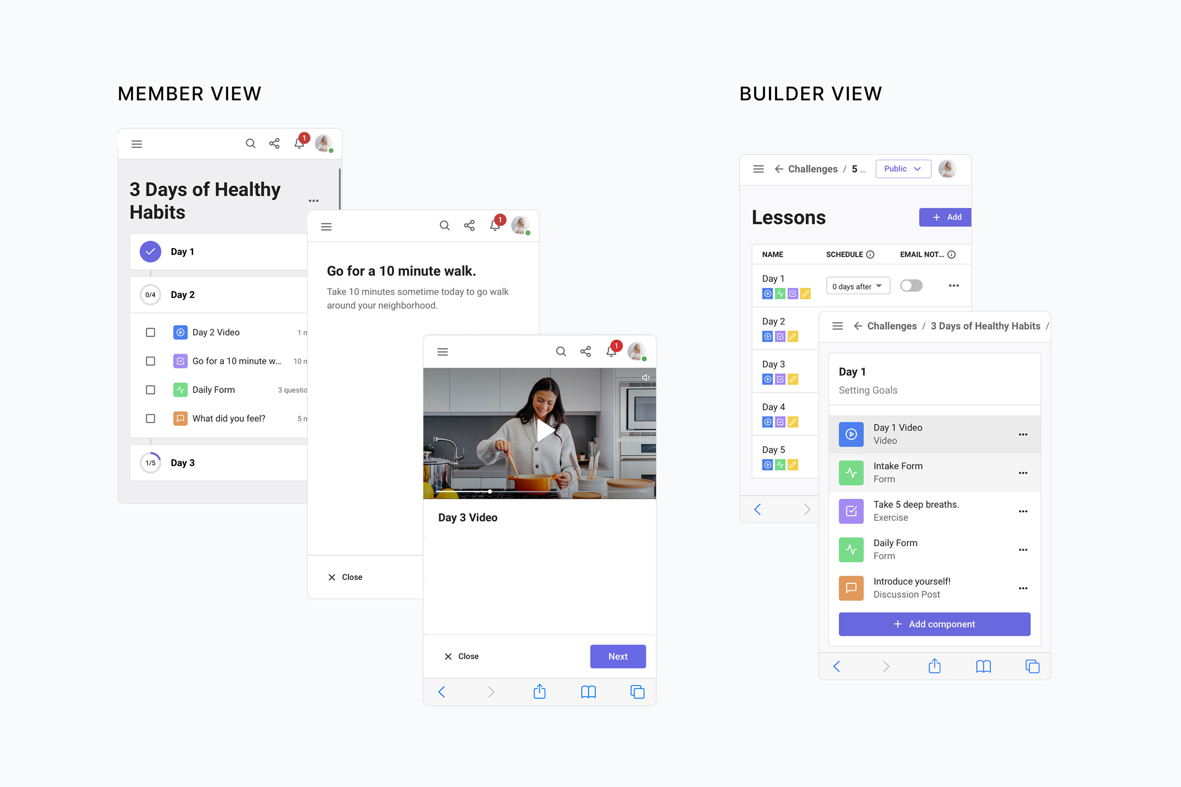
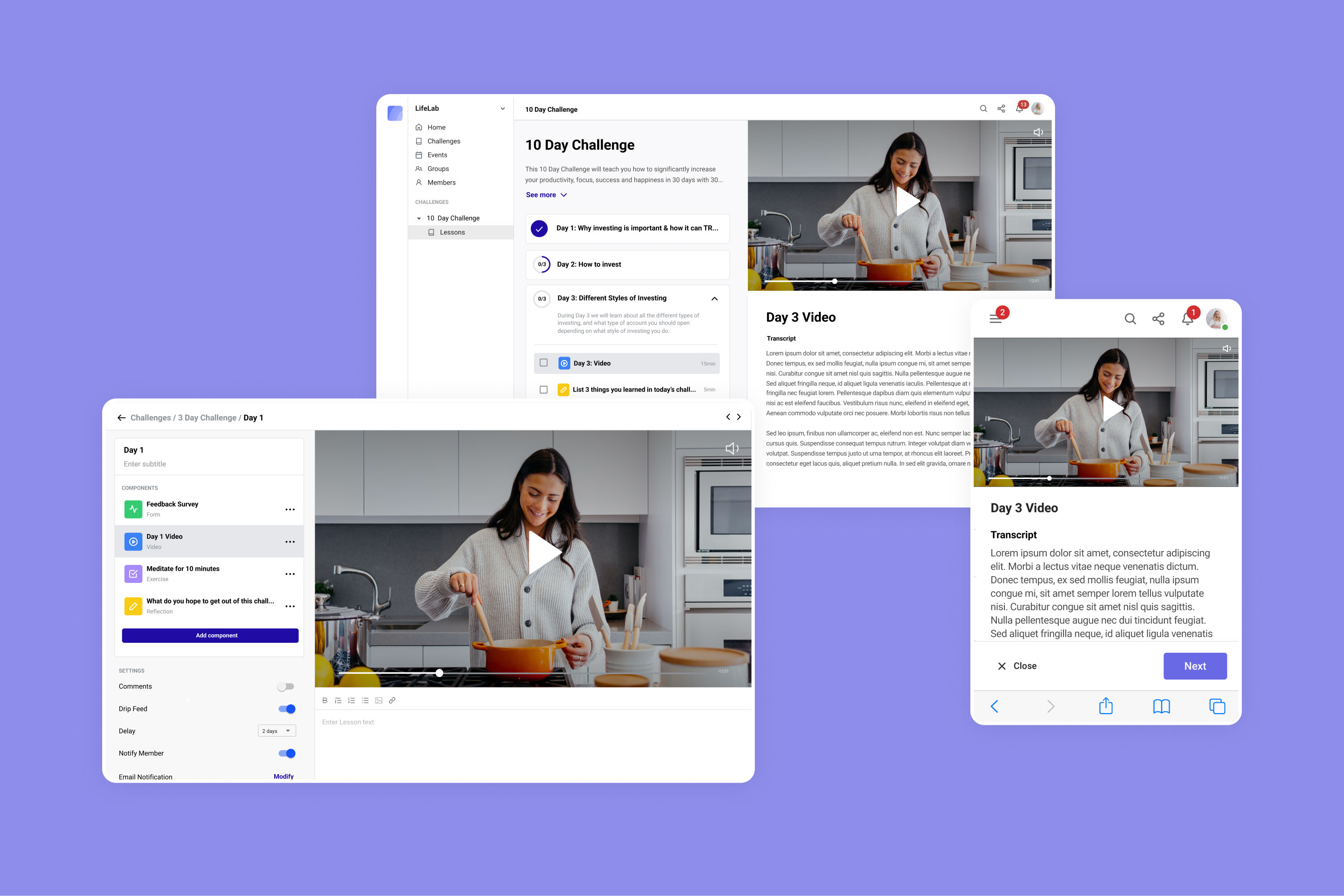
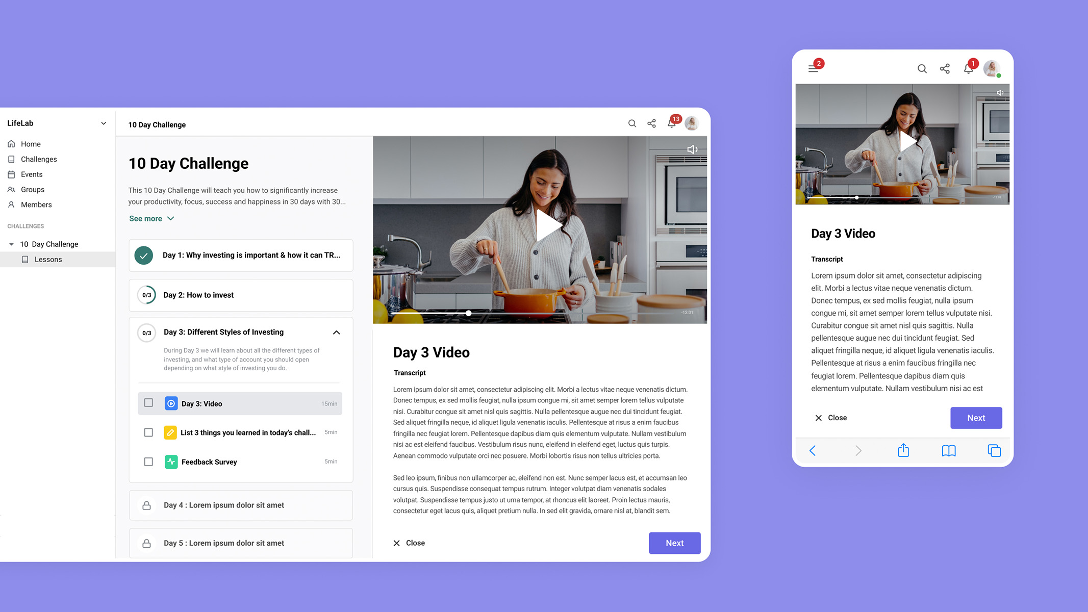
Zolt (formerly known as Framework) started off as a community platform—a place for your events, courses, and online forums. However, we soon began see a common trend with our main customers. They were all using Zolt to run time-based challenges. This presented an exciting potential market fit.
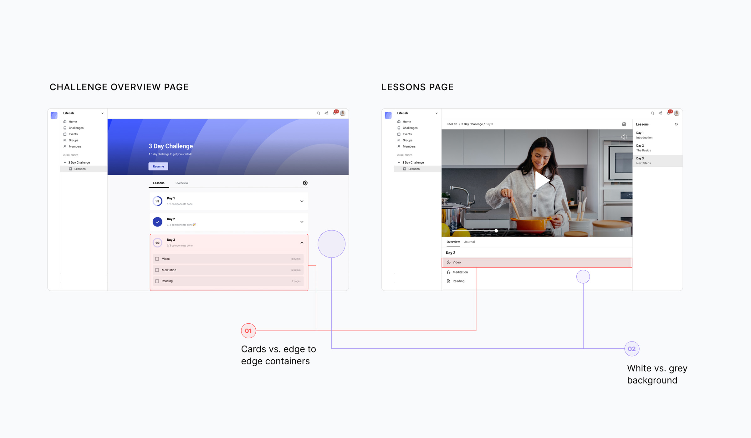
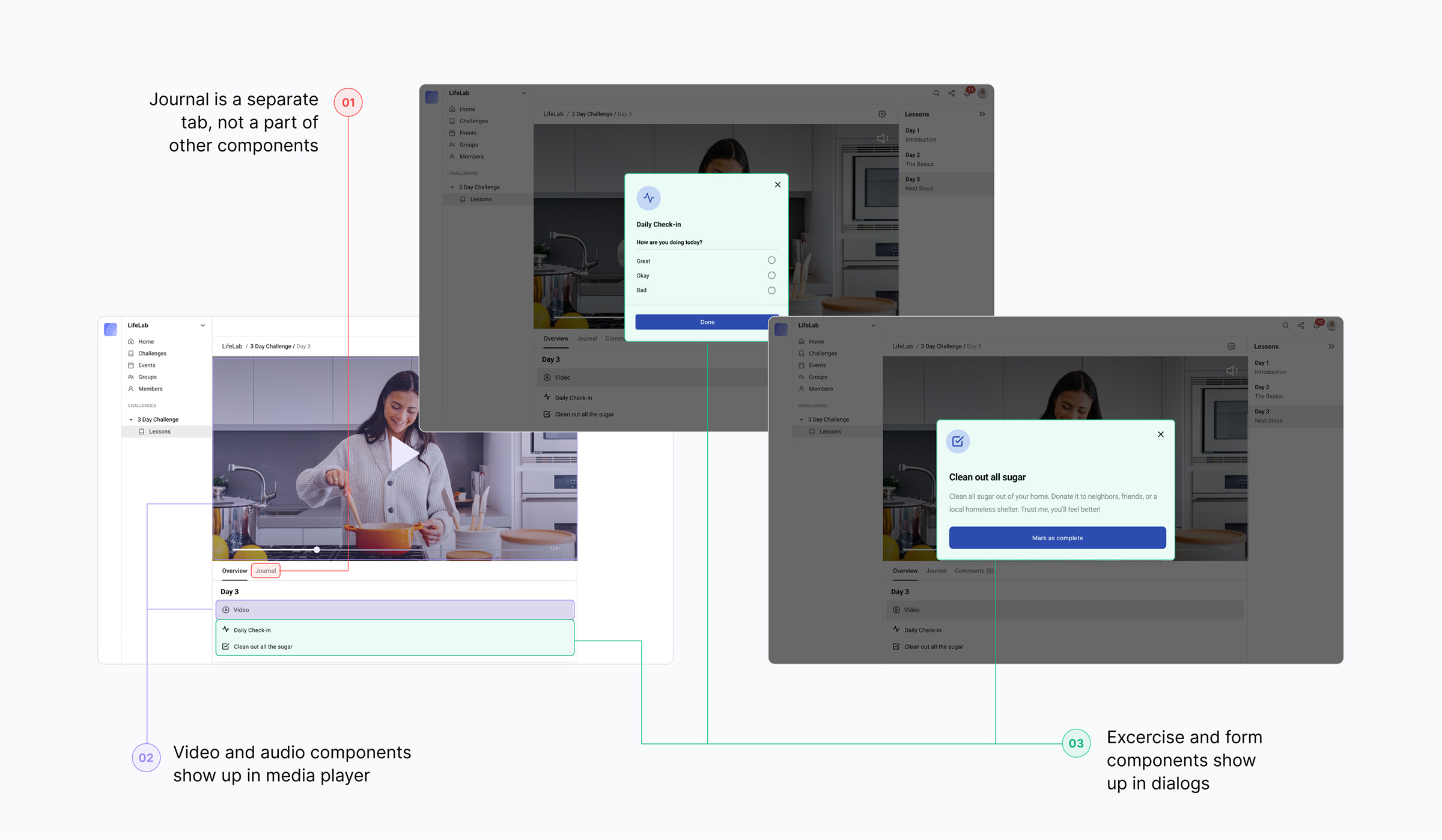
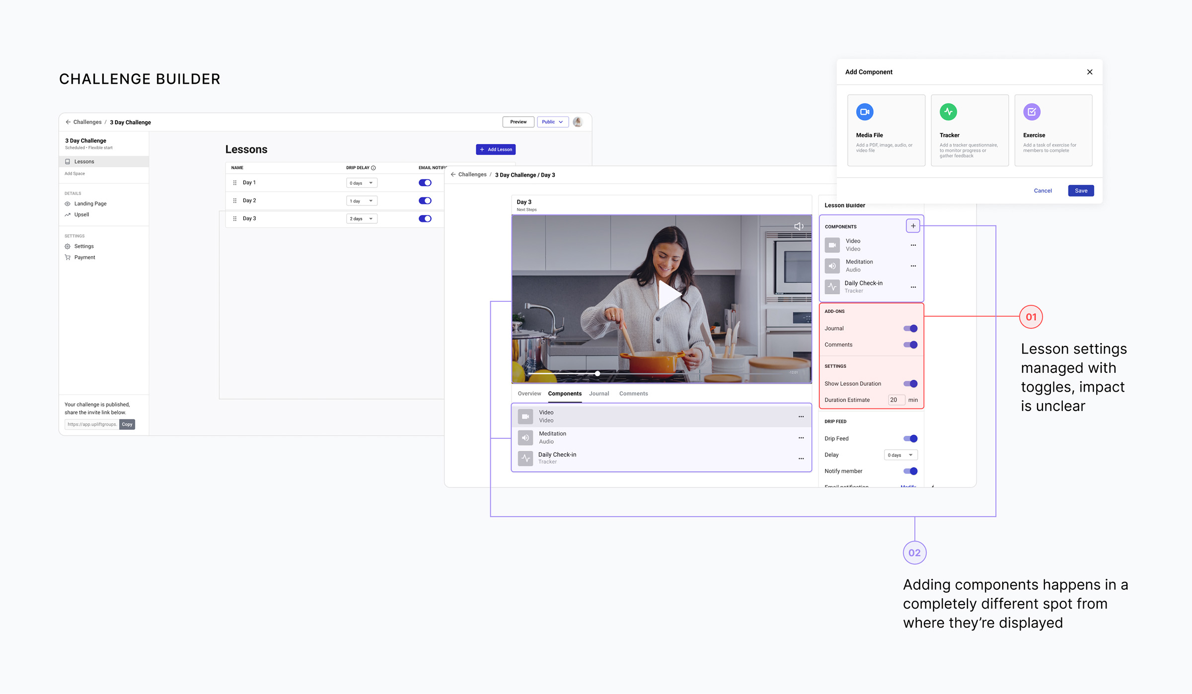
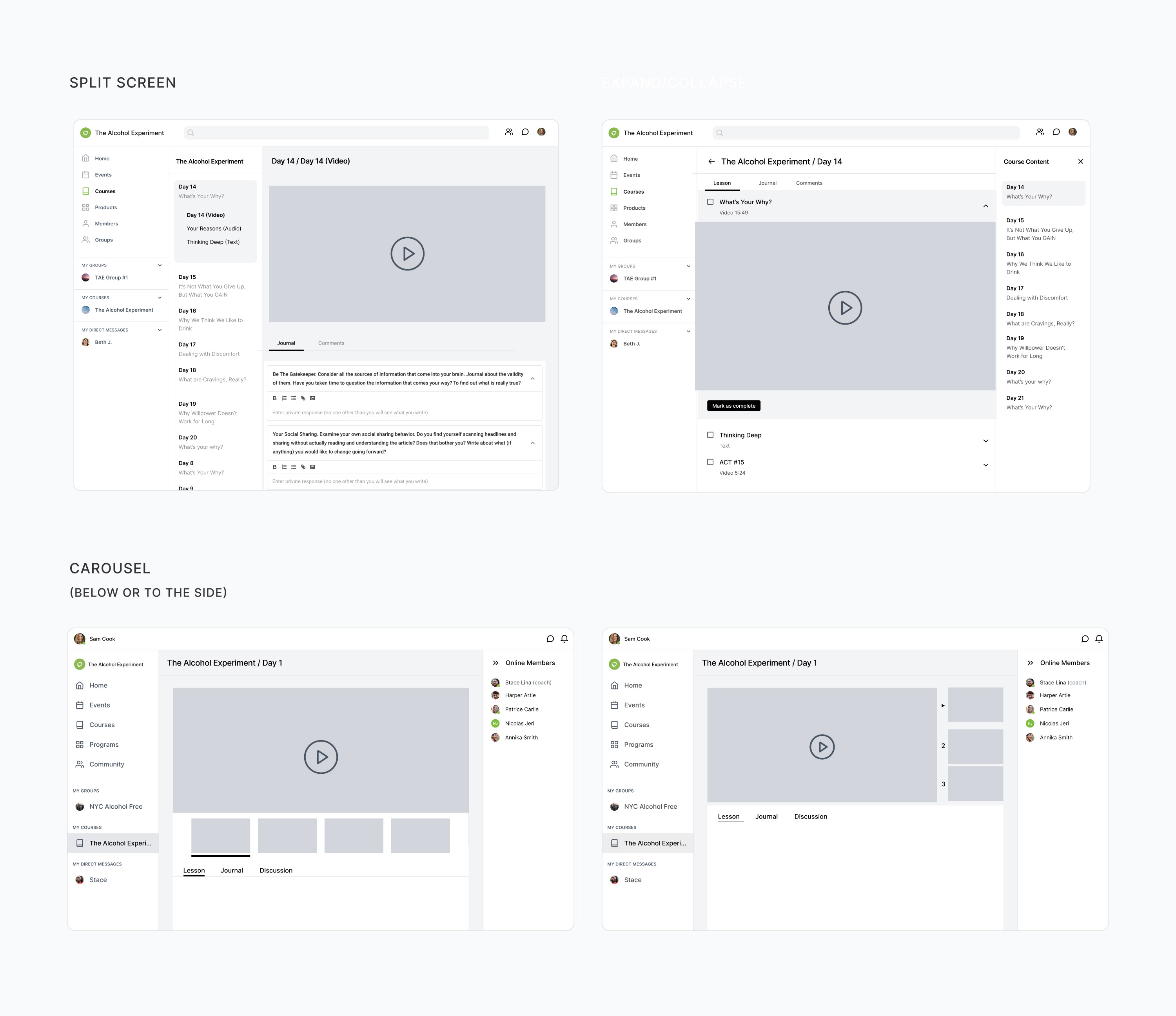
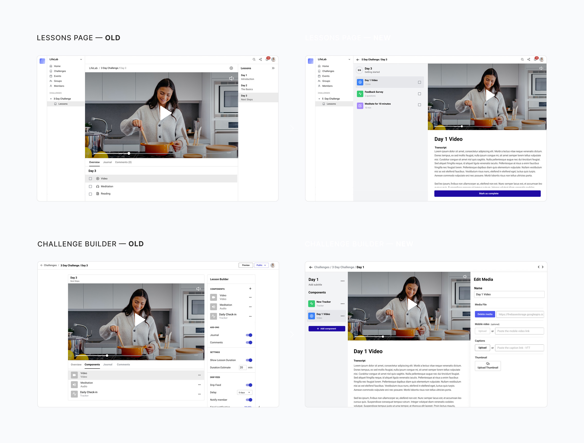
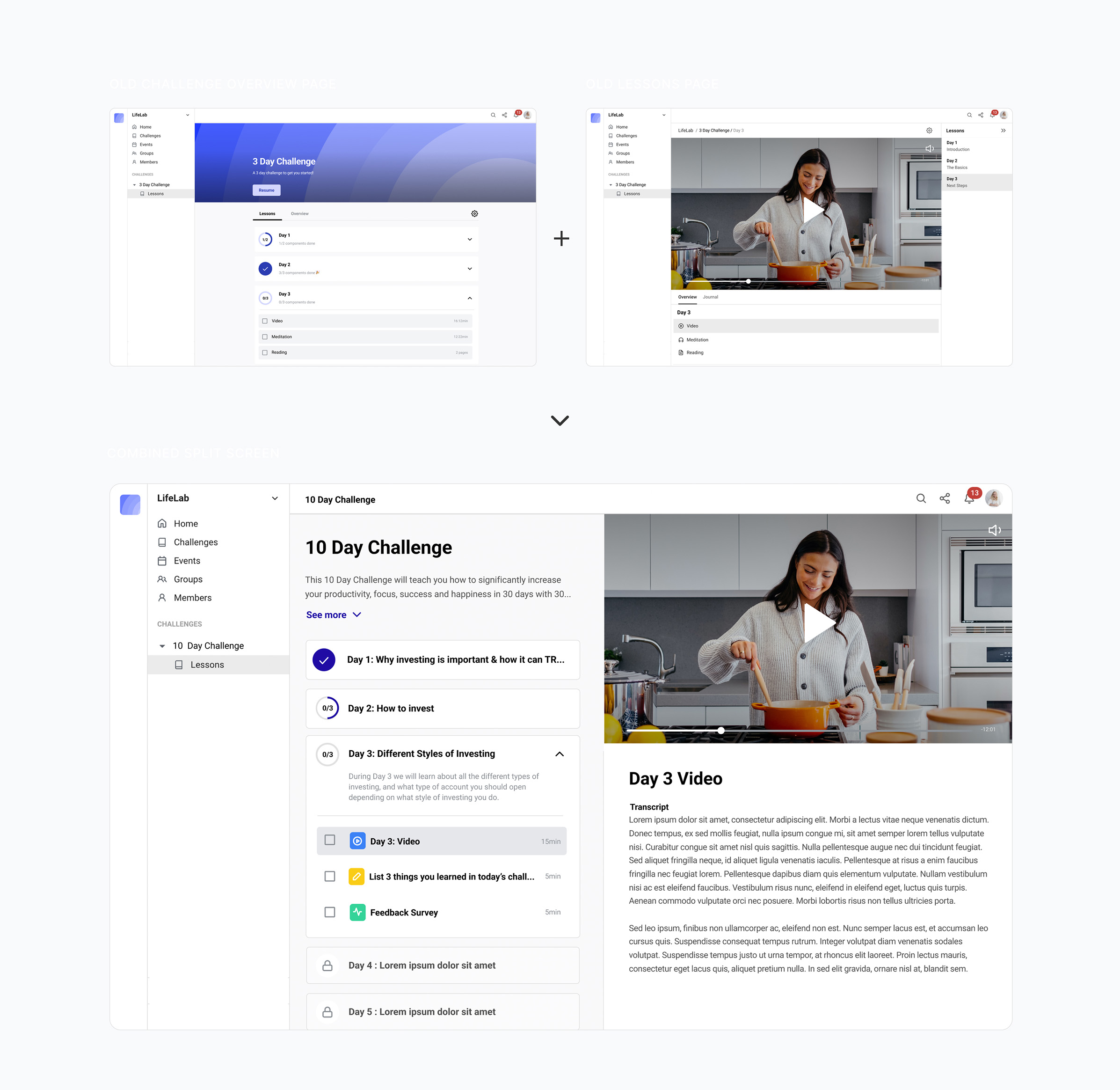
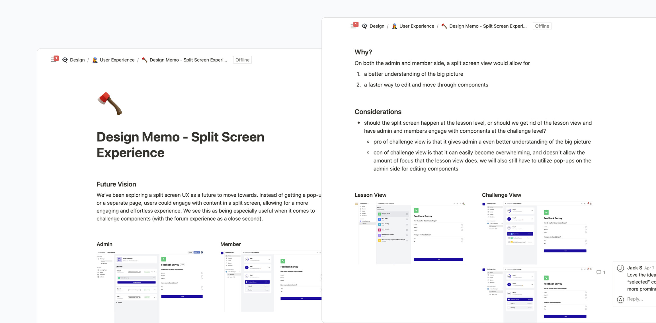
However, our product wasn’t customized to support challenges as seamlessly as we wanted. A redesign of our online course UX was needed to match our new focus. The catch? Do it without adding or removing features.
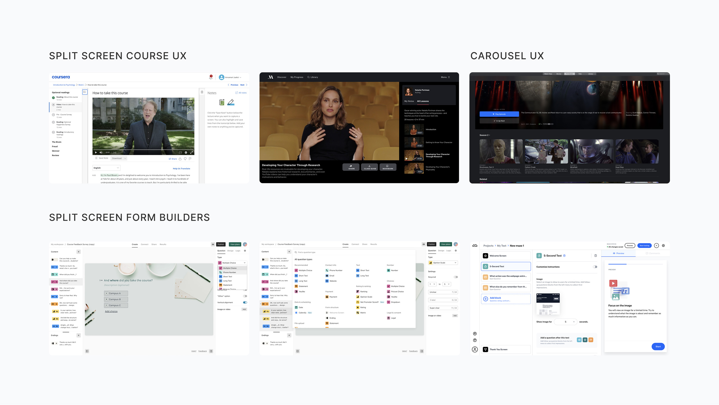
A deep audit into our current platform and a thorough research of industry standards, resulting in a complete reorganization of the elements to ensure a much smoother user experience.
Developer
CTO/Project Lead
Designer (me)
Research
Prototyping
Final designs
QA with engineering
I kicked the research off with a deep audit into our current experience. Starting with the end-user experience, I discovered multiple cosmetic issues, like inconsistent UI between older and newer screens.

I also uncovered architectural issues. Originally, our online courses had been built to support media files. You could add a video or an audio file to a lesson, with a bit of text below, and voilá, you had an online course.
However, due to user demand we had added new components, like exercises and forms. These were opening up as dialogs over the existing media files. There were deep inconsistencies between how different lesson components were interacted with.

Through interview sessions with our customers, I discovered that they were experiencing similar frustrations as they built the challenges. The location where they added components to their lesson, and the location where those components were displayed were separate, resulting in disorientation. You could add both components and add-ons to your lesson, which seemed duplicative and confusing. There was lots to improve.

I knew our use case wasn’t unique. There were plenty of other successful course experiences out there. There were also plenty of complex builders, ranging from other online courses, to online surveys and even online community platforms.
Three potential directions emerged from the competitive research.
A split screen experience, splitting navigation and content into two
A carousel, either below or next to the content
A expand/collapse UX, splitting content up

I wireframed each of the potential directions that emerged from the competitive research, in order to get a rough idea of how they would translate to our platform. The split screen began to emerge as a clear winner.
It allowed for a list of items (or components) to be organized neatly in one column, with the content in focus displayed in a separate column. This content column could be flexible enough to account for a variety of components, from media players to forms and quizzes. No more weird dialog UX!

The next step was to implement the split screen architecture to both the member and builder side of the platform in a more detailed manner, so we could align on all the details as a team. The list of components for the user to work through would be displayed in the middle column, and the component in focus would show up on the right. Admin could easily add and edit components in a similar, three column layout.

However, the split screen offered an interesting opportunity. We could remove the individual lesson page all together, and combine it with the challenge overview instead. This way, users would have a clear idea of what they had already completed, and what was coming next. It also allowed for less nesting and more transparency.

This was an internal project, pushed to the front not by client requests but by us as a team noticing a big pain point. Unfortunately, because of that, we didn’t have the time or resources to do a ton of testing.
Instead, we did a lot of internal alignment. I put together a Design Memo document running through my reasoning and proposals. This document was shared with our engineering team, and used as a way to discuss and align on a final way forward.

The final solution was a mix of my two proposals.
For the member, we would show the split screen at the challenge overview level. Users could see the upcoming lessons, and get excited for what is next.

However, for our admins using the challenge builder, we decided to keep the individual lesson page. When building a challenge there are a lot more components to keep track of, so allowing our clients to focus on one lesson at a time felt natural. We also knew that combining the two views in the builder would be much more technically complex, and we wanted to get this out and get reactions from real users before we spent too much time on a MVP.

Overall, the split screen solution allowed us to resolve a lot of pain points for our users. I was able to pull all the different floating elements (media components, the journal, exercises, and forms) and display them as a clear list for the user to work through. It also allowed for a more unified UI.
In addition, this new simplicity allowed for better responsiveness and an improved experience on smaller screens. Each column could function as its own page, with users being able to navigate seamlessly.

After releasing the split screen UX, we’ve done extensive user testing by running hour long interviews with new users. We’ve received incredibly positive feedback, both from existing users and from the user testing. In addition to a positive reaction from users, the split screen UX has allowed us to add 3 new component types.
Users now describe building challenges as fun, which is what we want, considering challenges are at the center of our product offering. We’ve also seen a huge increase in the diversity of components used, as they’re much more accessible and user friendly.
Ideally we could have done more user testing before releasing a update this large. However, we instead chose to iterate fast, due to our knowledge of our user base and their needs. In this case, we found it more valuable to get an improvement out there as soon as possible. We could then track how users interact with it, and make improvements as needed.
